TiriVelo Pet Care, Redesigned.
Shipped to production. In 4 weeks.
22 Pages Shipped · 4 Week Timeline · 2 User Types · 1 Inherited System
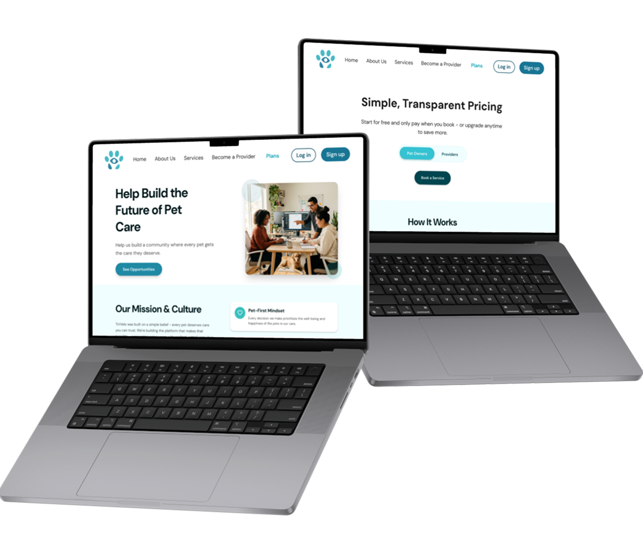
00 — Prototype Walkthrough
Prototype walkthrough — full Provider Sign Up flow from account creation to availability setup.
01 — The Brief
Two user types. One evolving product. Four weeks to ship.
TiriVelo is a pet care marketplace connecting pet owners with trusted local providers. I joined mid-stream, inheriting a design system and partially built pages from previous designers. My job wasn't to start from scratch, it was to understand what existed, identify what needed fixing, and ship. The existing screens had too much on them. The CEO wanted simple and modern. I built new screens using the inherited system but stripped back to only what was essential.
Trust isn't a feature. In pet care, it's the entire product.
02 — Research
Reading the room before touching the file.
User research had already been conducted by the previous team — my job was to interpret it. Two very different users: pet owners seeking trusted care, and providers navigating complex onboarding. Stakeholder feedback from the CEO, engineers, and design team became my primary ongoing research signal throughout the four weeks.
→ Providers
Providers found onboarding confusing — too many steps, unclear progress, and ambiguous field labels.
→ Pricing
The pricing page needed to reframe commission as platform value, not a barrier to signing up.
→ Careers
The careers page needed to attract mission-aligned talent while staying clean and on-brand.
03 — The Work
Two marketing pages. One provider flow. Shipped.
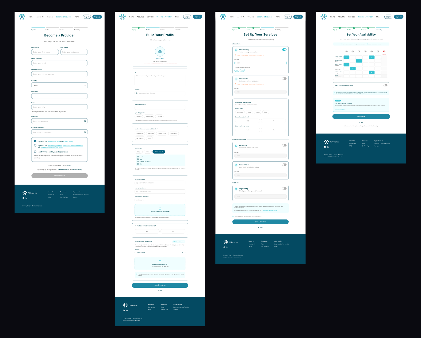
→ Availability in seconds
A simple tap-to-select grid that makes scheduling feel effortless, not like a form.
→ Conditional insurance
YES reveals fields, NO shows an educational nudge.
→ Mandatory photo upload
Trust starts before the first booking.
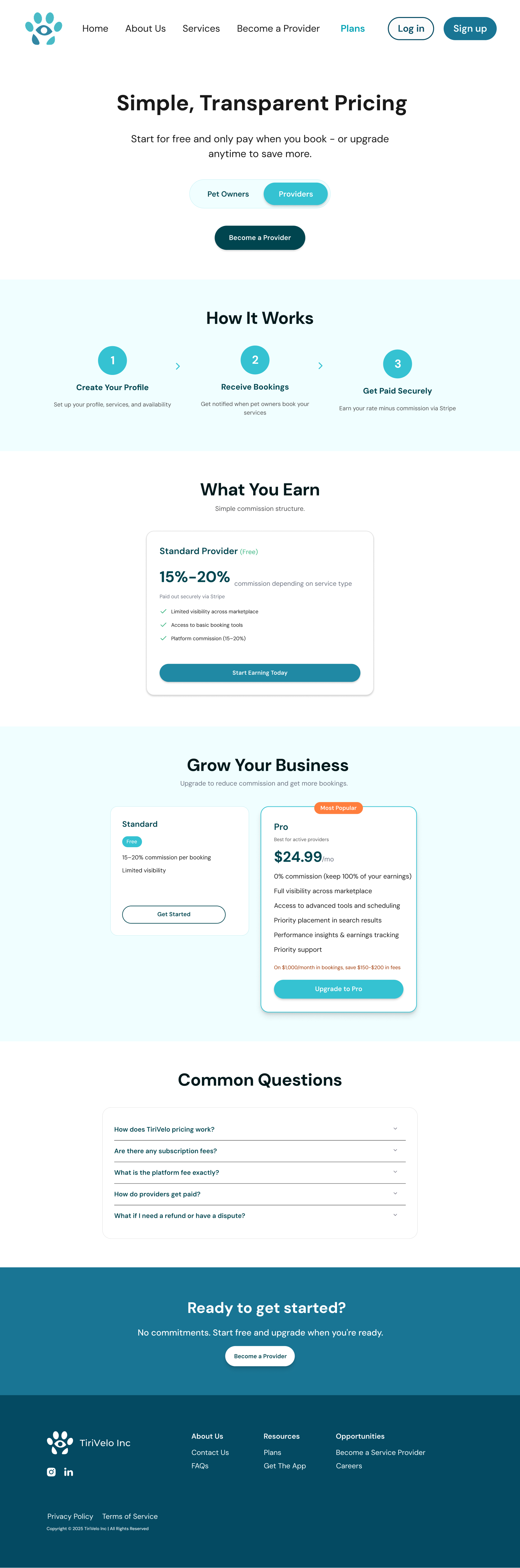
Simple Transparent Pricing → How It Works → Grow Your Business — a page designed to build confidence, not hesitation.
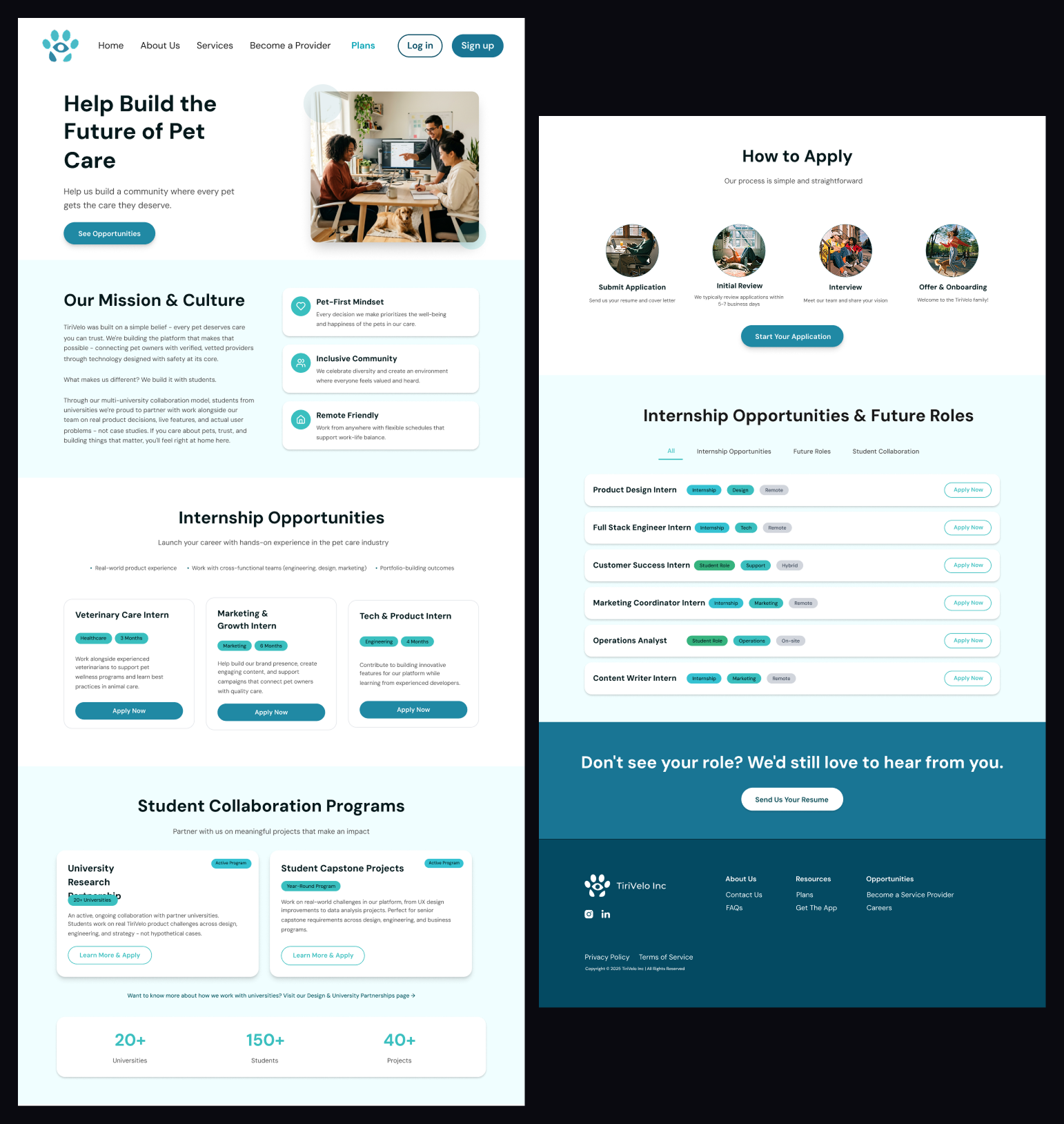
Clean, on-brand, built to attract mission-aligned talent to a growing pet care platform.
04 — Systems Thinking
Every provider decision is a pet owner experience.
Designing the Provider Sign Up flow meant thinking beyond the form. Every field, every step, every piece of information a provider submits becomes a trust signal on the other side of the platform — the pet owner's side. A mandatory photo isn't just a profile requirement. It's the first thing a pet owner sees when deciding whether to trust someone with their animal.
Provider Inputs
Pet Owner Trust Signals
Mandatory photo upload
→
First impression on booking card
Conditional insurance fields
→
Verified badge on provider profile
Tap-to-select availability grid
→
Real-time booking confidence
Separate first + last name fields
→
Professional, trustworthy profile
Designing for providers meant designing for pet owners, at the same time.
05 — Outcome
Given the timeline, the inherited system, and the live client — all work that shipped mattered.
Two marketing pages and a full provider onboarding flow went from design to production in four weeks. Working inside someone else's system under real constraints taught me how to read a system quickly, turn stakeholder feedback into design direction, and ship work that holds up when real people use it.
06 — Reflection
What I'd do differently.
What Worked
Getting up to speed on an inherited system fast, treating stakeholder feedback as design direction, and shipping under pressure without losing quality.
What I'd Change
I'd push earlier for direct user testing with actual pet owners and providers. The CEO knows the business — but the user knows the experience.